
Ecommerce and Retail • Ecommerce Design


When a prospective customer first lands on your ecommerce website they’re not just seeing an online store—they’re seeing your brand. So it’s essential to give the right impression and entice them to start shopping, with a site that loads quickly, looks beautiful, is easy to use, and shows exactly who you are and what you offer.
It’s a balancing act, but you can tip the scales in your favour by making small tweaks to your website design that will look awesome and boost your conversion rates. Here’s how.
The days of cramming everything into that first screen you see are long gone, and if you take this approach, you’re likely to scare off customers before they even get started. Leaving plenty of white space will help your images stand out and encourage visitors to read your small text boxes in full. It’s a real case of “less is more”.
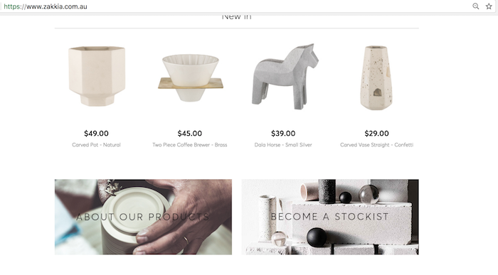
Neto homewares retailer, Zakkia, use white space really effectively on their website to create a clean, minimalist feel that works perfectly with their swedish-inspired pots, vases and tablewares.
One last thing: your “white space” doesn’t actually need to be white; “blank space” might actually be a better term for it. It could be one of your theme colours instead.
Which brings us to my next tip…
Unless you’re a brand new business, you’ve probably already established your palette of corporate colours as part of your brand identity. This is usually the best starting point for your ecommerce website’s colour scheme, but don’t feel pressured to use all the colours in your palette. You have plenty of other options:

Splashes of blue on the The Naked Co. website draw attention to buttons and call to actions
You’ll want to keep your colours fairly consistent so repeat customers always know they’re landing in the right spot, but you can still add seasonal highlights to create a mood. For more ideas on how to use colour to create the right emotional response in your visitors, check out CoSchedule’s colour psychology guide.
The “wow” effect of a big, beautiful image is what’s driven the popularity of so-called “hero images” on ecommerce homepages and landing pages. In one glance, a hero image tells your website visitors who you are and what you offer. You can use a single image, sliders (a series of images that appear in turn), or even a video. And, just like your site colours, your images can also be tweaked to suit the season, or particular promotions.
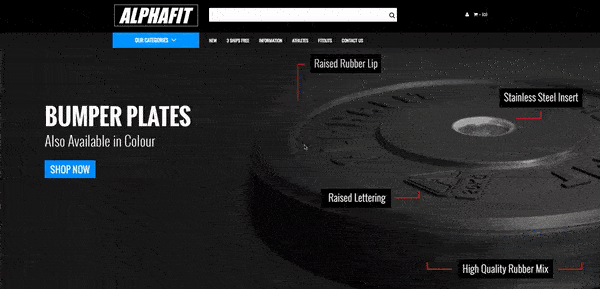
Sports and fitness retailer Alphafit use powerful hero images on their homepage slider to attract attention.
You’ll also want beautiful images on each product page and throughout your ecommerce website; while the highest resolution looks the best, your visitors won’t wait to see it if the file loads too slowly—and slow page loading can also affect your SEO rankings. As with many aspects of website design, it’s a balancing act. There are a few workarounds, like using highly compressible formats for larger files (e.g. JPEG, rather than PNG), or serving your static images from a content distribution network (CDN), such as CloudFlare.
If you’ve studied design or typography, you probably know exactly what to do here. For the rest of us, there are convenient online tools to help find pairs of fonts that work beautifully together, making your headlines pop while keeping your body text easy on the eye. If you’ve already chosen one font for your ecommerce website, check out Canva’s Typography made easy to find its best friend. If you’re just looking for ideas, check out their Ultimate Guide to Font Pairing.
Your call to action button should inspire your ecommerce website visitors to jump in and take action, so don’t scare them off with alarming colours or negative wording. Use clear, action-oriented text like “buy now” or “add to cart” on your product pages, or “tell me more” on your informative landing pages. Make sure the nearby text is compelling as well, selling the benefits of clicking that button in as few words as possible.
| Related Reading: How to Write a Call to Action That Converts (Plus Four Great Examples)
Recommendations about where to place the call to action on your page vary wildly, from near the top, to in the middle, to right down the bottom, or even repeating the button throughout the page. So it’s something you should play with to see how it affects your conversion rate. Keep in mind that not everyone is going to take your preferred action, and don’t be scared to provide a few extra links to other actions, but keep them small and unobtrusive.
These days, many ecommerce platforms (and most website content management systems) offer a variety of premium and/or free themes that are mobile responsive and often optimised for a specific use case. Themes are like a shortcut to creating a gorgeous website sooner—you just choose a theme that matches fairly well to the layout and navigation elements you want, and then tweak it to suit your brand. But design trends change over time, and you may find you need to start customising a lot of design elements just to keep your website looking fresh. If this is the case, you can usually re-theme your ecommerce website to something more modern.
Neto is the only Australian retail management platform that provides a complete solution for ecommerce, point of sale, inventory, and fulfilment. And we’ve got everything you need to build your conversion-centred ecommerce website, from fully-responsive themes and access to your site code, through to add-on integrations for analytics and A/B testing. Now design is sorted, need some ideas for what to say? Check out our tips for conversion-centred copy and calls to action.
