Design elements to make your ecommerce store a success

The design of your site is about more than just fonts, images and colour schemes. It is also an important part of how your customers experience your site and your brand, and it alone can convince them to buy from your business. Having traffic on your site is only part of the battle, and converting visitors into sales is vital to ensure your business meets its goals.
Your website is the only interaction a customer may have with your business, unlike in a physical store where a sales assistant can discuss a potential customer’s issues and think on their feet to close the sale. If the site doesn’t impress the buyer, they will simply navigate away. If your website is showing a high bounce rate, it's time to look closer at what design elements can be improved. A few simple tweaks can be the difference between making a sale and losing the customer to a competitor.
Focusing on the customer
Navigation
Simple menus and intuitive product categories will go a long way to closing a sale. Ensuring the user can navigate through the site is important to prevent them from feeling lost. Use easy to follow buttons on highly visible parts of the page and make getting to the shopping cart page as simple as a single click, regardless of how far into the site they have gone.
Readability
A 2008 study revealed that users consume web page content in an F shape, with as little as 28% of the content being read. This means that they read the first few lines to begin with, then scan the page, looking for key points that tell them what they need to know. By placing your important content along this path, your site has a much better chance of conveying what you want your customer to know. This will lead to better engagement and a higher chance of converting a browser into a buyer.
Make it mobile
Internet usage habits have shifted, and now more people browse online using a mobile device than on a desktop computer. People are looking at your site while they are commuting, standing in line, on their lunch break, and virtually any time they have a few minutes to spare. By making sure your site is streamlined for the smaller screen real estate while remaining fully functional and able to complete transactions, you will give your business the best chance of improving conversion and sales. People don’t find things online they want to buy then wait until they get home to their desktop to purchase; instead, they find a site that will serve them right then and there.
Keep it fast
Site loading time is a key element of web design that affects SEO and conversion. People are more accustomed to faster internet connections, and any site that takes its time with graphics or other large elements will risk losing the customer before they even see the site. Keep image files at 100kb or less and use CSS instead of images for background colours to reduce the time your pages take to load.
Closing the sale
Security
Customers need to feel that they can trust your site to keep their details safe. In design terms, this means ensuring your SSL certificate is up to date and advertising this fact with a graphic or some writing. There is nothing more disconcerting for a customer than receiving the warning message informing them that the credentials have expired.
Buy without signing up
While it may seem like a great way to get user information and further increase your audience, implementing a compulsory sign-up function is listed as one of the most disliked aspects of the online shopping experience. Allowing for a guest checkout system will build trust with customers who are concerned with companies retaining their data, or those who are in a rush. This can be followed up with a gentle prompt to sign-up, along with an extra incentive if they do.
Streamline the checkout
A great checkout limits the opportunities for customers to change their minds and abandon the sale. This means moving through the system quickly and smoothly, with as few pages as possible. A common theory is the “three-page process”: The shopping cart Collecting payment and shipping information Confirmation of order. If the site splits the process into too many steps, the customer has more time to talk themselves out of buying the product. Keep it concise to ride the wave of enthusiasm that caused them to place the product in the cart to begin with.
Mutual benefits
Your site’s design should make customers think that a purchase is the most logical conclusion to visiting it. It should cater to their needs by making it simple to find the things they want while ensuring they aren’t discouraged from completing a transaction by a system that requires effort to navigate. By ensuring your site’s design principles combine speed with usability, you will give it the best chance to convert leads, increase sales, and improve business performance.
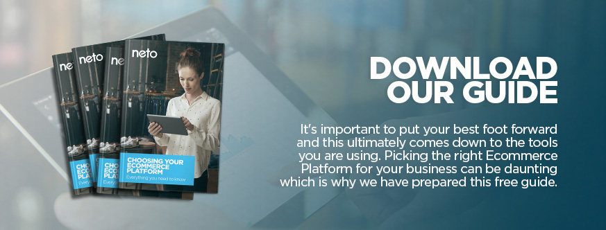
Does your Ecommerce software have everything you need to design your website the way you want? Download our free guide 'Choosing Your Ecommerce Platform'.