
Discover the best conversion techniques for your ecommerce website

The ultimate goal of an eCommerce website is conversion. This should drive all design decisions, but this doesn’t mean enormous flashing “buy” buttons and windows that refuse to close until a purchase is made. Instead, your site’s design should make a purchase feel like the most logical conclusion for visitors.
The basics
The design is about communicating with users. A site that is easy to read and look at will aid any decisions you make about navigation.
Great design isn’t easy and involves a lot of small elements coming together to create a usable and beautiful site. The popularity of templates across CMSs, such as WordPress, has taken a lot of the details out of the site owner’s hands, making it simple to get a site online. This has both advantages and disadvantages compared to complete web design but has proved successful for businesses who lack the time or skills to code from scratch.
A few aspects to consider when either choosing a template or starting from the ground up:
Sans-serif fonts are considered better for web design.
They are cleaner to look at and easier to read. Ideally, your site should use no more than three font types throughout, however, these are generally different weights of the same style e.g. standard, bold and semi-bold. This ensures design consistency and a streamlined design throughout.
The right images can have a dramatic impact,
They should be used sparingly and be professional and high-quality. Many sites use stock photography, both free and paid, as well as their own custom created graphics. These can include infographics, which are perfect for outlining details of your brand and services.
Your palette should be harmonious.
Colours should both contrast and complement each other. Big, vibrant colours should be used for calls to action and buttons, which will ensure they have the desired effect.
Beautiful design is about symmetry and flow.
This doesn’t mean that the left side of your site should match the right. It means that margins and placement of elements need to be balanced and consistent. Columns should align within the page and between pages, boxes must line up, and centring of type and image needs to be consistent and accurate.
The Blue Pod Coffee Co make good use of symmetry to differentiate between their domestic and commercial products:
.png)
Navigational choices
Make fewer categories
While it might seem like a good allowing visitors to disappear into particular areas of your site (through complex navigation) might seem like a good way to help your customers find what they need, it often ends up confusing them. Different people have different ways of browsing, use different terms when referring to products, and have different ideas about what forms an enjoyable browsing experience. Instead of second guessing how your site will be used, it is easier to just keep it simple. Essentially, your site should aim for users to make the fewest number of clicks possible to find what they are looking for. Three clicks is a good guideline, but this depends on the size of your product range and the variations of each product available.
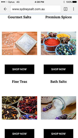
A great example of simple, functional design is Sydney Salt Co. Their mobile site is straightforward and minimalist, with the navigation buttons kept to the four most important:
.png)
Once they have scrolled past the landing screen, the user is able to browse the categories one-by-one:
Their desktop site is just as elegant:
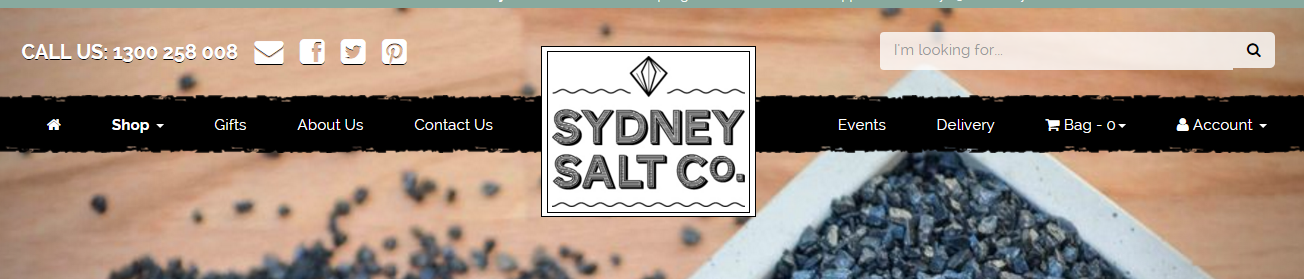
While it isn’t as sparse as the mobile site, it is still easy to process visually and understand what to click to get where you want to go.
Again, scrolling reveals more engaging visual elements and calls to action:
.jpg)
Menu placement
Menus should be along the top of the page or down the left (if you are making a website in a language that reads left-to-right). A common tactic, especially for mobile devices, is what is referred to as a hamburger menu. It is hidden until the menu icon, three horizontal lines resembling a hamburger, is clicked. It will then expand to provide navigational options and lead users around the site.
Use links in the text sparingly
Text links are less about navigation and more aimed towards SEO factors. While they are important, they are also less visually appealing and difficult to click on a smartphone screen. On a desktop, with a precision device like a mouse or trackpad, they are fine, but even the smallest fingers can have trouble when using a mobile device. People assume that if there's a link, it’s important. Make sure you are linking to relevant pages that will enhance their shopping experience, not sending them deeper into your site for no reason.
Don’t reinvent the wheel
While it might be tempting to innovate and create an entirely unique way to navigate your website, it isn’t advised. Menus that leap at the user from random angles may seem like a great attention-grabber, but humans are delicate creatures and will more likely bounce from a site that doesn’t follow conventional design aesthetics rather than embrace it.
Conventions are useful and help guide users by satisfying their expectations. While it may seem like doing what everyone else does will result in a boring website, it actually reduces the learning curve and ensures your other design elements aren’t hindered by a hard to understand interface.
Web sites are a tool and should be designed as such
As an eCommerce business, people are generally on your site for a reason: to buy. Your site is the tool to get what they want and they aren’t using it as an end in itself. Think about the tasks a user will want to do on your site and then work backwards. Common tasks, such as buying salt in the case of Sydney Salt Co, should be front and centre. Other less used pages, like the About Us page, the terms and conditions, privacy policy, and even the contact page, can be placed in a footer or sub menu.
Give more than the user expects
The design is about more than looks though and poorly designed sites often perform badly in conversion rates, bounce rates, TOS statistics, and other Google Analytics metrics, and this can also affect SEO results.
While not strictly related to improved navigation, a user is more likely to stick around and explore your site if there is value beyond the products for sale. If your site can be considered a repository for knowledge through the inclusion of blogs, videos, infographics, and a full range of engaging content, then people will consider it a destination site, rather than just a storefront. Designing your store to accommodate these elements and directing customers to them will help you lower your bounce rate, increase the level of engagement, and improve your conversion.
