Neto Blog

View latest posts

Responsive is the Word!

Responsive is the Word!

Ryan Murtagh
Ryan Murtagh

If you haven't heard it yet, you soon will. Responsive is the buzz word on the e-commerce streets. Learn more about responsive web design below.

responsive website is a website that responds differently when viewed on different device sizes. For example, when viewed on a mobile device the website automatically responds to better cater for mobile user needs.

Why is having a responsive website important?

  • Mobile usage is exploding (last year over 20% of Google searches were being performed on mobile devices). Responsive websites are designed to be "touch" friendly.
  • Responsive design adapts to future devices, therefore future proofing your design.
  • Responsive design is preferred for SEO (Google’s Pierre Farr has gone on the record to declare that Google prefers responsive web design over mobile templates).

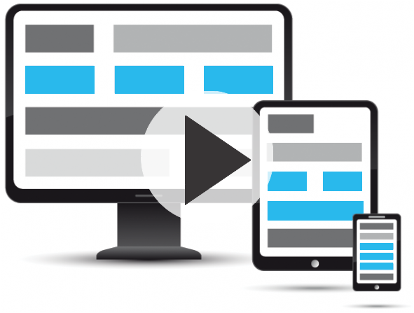
Still not sure what we are talking about?

Click here to watch a short video to learn more about responsive design.

Click here to view our responsive design showcase!

Are you ready to join the responsive revolution? Contact our sales team to find out about our great responsive design offers. Contact Us » or Call 1300 730 300

If you liked that, why not subscribe for more?

Scale your business with tips, tricks and inspirational case studies delivered to your inbox.

Unsubscribe at any time

Start your trial today

No fees. No credit card. No risk.

Shopping Cart - 0 Items