
Should I be considering a responsive website?

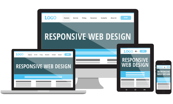
A responsive website is one that changes layout according to the user’s device, making your site much more usable for different devices. Your customers could be accessing the site through a mobile, tablet, or desktop computer, each with different screen sizes and therefore different design requirements. A responsive design solves that problem by detecting the device that’s being used, and applying the most appropriate layout. In essence, your website will look awesome and be much more usable for everyone!
An extensive 2014 Morgan Stanley report has shown that by 2015, most people will be using mobile phones to access the internet[1]. Tablet usage is also through the roof. This makes responsive design an absolute requirement; without it you’re guaranteed to miss out on a vast number of sales.
Still not convinced? Here are 5 benefits of responsive web design:
1. Your site will look awesome on any device
Aesthetics are an important aspect of web design; a customer visiting a non-responsive site on a mobile phone will barely be able to see the elements on the screen, let alone appreciate their beautiful design. A responsive design fixes this by ensuring that every page on the site is aesthetically pleasing, making the user feel all warm and fuzzy with artistic appreciation.
2. Your sales will increase due to improved usability
As briefly explained above, the overall layout of each page on your website will be designed with each different device type in mind - typically mobiles, tablets, small desktop computers, and large desktop computers. When a customer uses their iPhone to browsing your store’s category page, the products will be presented in a clear and usable manner, appropriate to the size of their device. Similarly, a user who visits your checkout page on an iPad will complete their purchase with a sense of satisfaction, due to the page being laid out especially for their tablet.
3. Your branding is much clearer
If you’re thinking about growing your business, re-enforcing your branding should be on your mind. A responsive design ensures that each element and colour on the page is clear, and chosen to work with your company’s unique branding.
4. The site is easier to manage due to a single template set
No more managing separate website and mobile store templates! With responsive design, everything is kept in a single set of templates, which means that when you make a change to a page, it’ll appear on every different type of device.
5. Reduced SEO maintenance
Similarly to point 4, SEO work such as keyword optimisation only needs to be completed for a single template set, reducing maintenance time considerably. Also, with separate desktop and mobile templates, you may run the risk of running into duplicate content issues, which essentially results in a Google ranking penalty, pushing your site further down the page when searching.
Conclusion
So there you have it! If you haven’t thought about responsive design until now, consider yourself educated. To find out more more about web design, talk to us.
[1] New Study Shows the Mobile Web Will Rule by 2015, http://mashable.com/2010/04/13/mobile-web-stats/
