
Ecommerce and Retail • Ecommerce Design

In Part 1 of our article on inspiring website designs we focused on the all-important UI (user interface) experience – how your website looks and the elements your visitors view. But a beautiful website also needs to be functional and easy to navigate and this is commonly known as UX or User Experience – it’s how your website works.
So let’s take a look at some of the important design elements that need to be incorporated into your website for a happy user experience.Your potential buyer has made it to your website and the next vital step is telling them where to go. There should be a logical hierarchy to your website – standard pages are standard for a reason so be sure to include an about us page and a contact page as well as links to testimonials and your blog. Most importantly, categorise your products in a logical way and stick to the three-click rule: You want your customer to find what they’re after in three clicks.
I love linen is the perfect example with categories based on areas of the home - bedroom, bathroom, kitchen, etc. What’s more, the drop down menu displays as you scroll over each category.
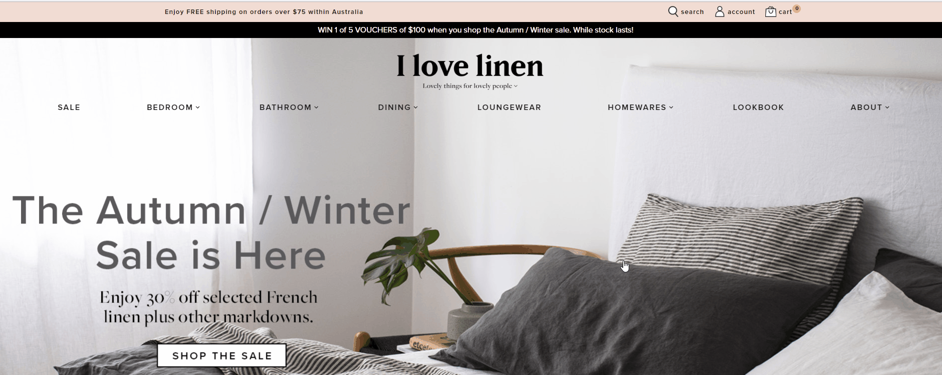
This is a great feature from a user’s perspective – they don’t have to click through, only to realise it wasn’t the category they wanted after all. Then, once you’ve entered a product category, you know exactly where you are on the site, through the breadcrumb navigation at the top left.
Mentone Educational is another great example and you’ll notice that the menu still displayed as you scroll down the page.

Sometimes sensible categories just aren’t enough when your customer is savvy and knows exactly what they want. That’s where a sophisticated search function comes in. All ecommerce websites should include a basic search function where customers can simply type in a word and click ‘go’. But if you combine your search function with menu categories then you’re on to a winner (think airline or hotel booking engines).
A great example of this idea in action is Car Mods Australia. The first thing you’ll notice is their parts finder, where you search by year, make and model. A simple feature that makes shopping easy and a feature that many customers come to Neto for.

Computer company RamCity also uses this type of search to allow shoppers to quickly find exactly what they need with three fields:

All this is well and good, but what if you were out and about with a bit of time to spare so you jumped on your mobile to check out a website, only to find it clunky and displaying strangely on your phone. You’d probably end your search there and then, which is why it is vital for your website to be mobile friendly. In fact, you’re not likely to be indexed well on search engines if you’re not.
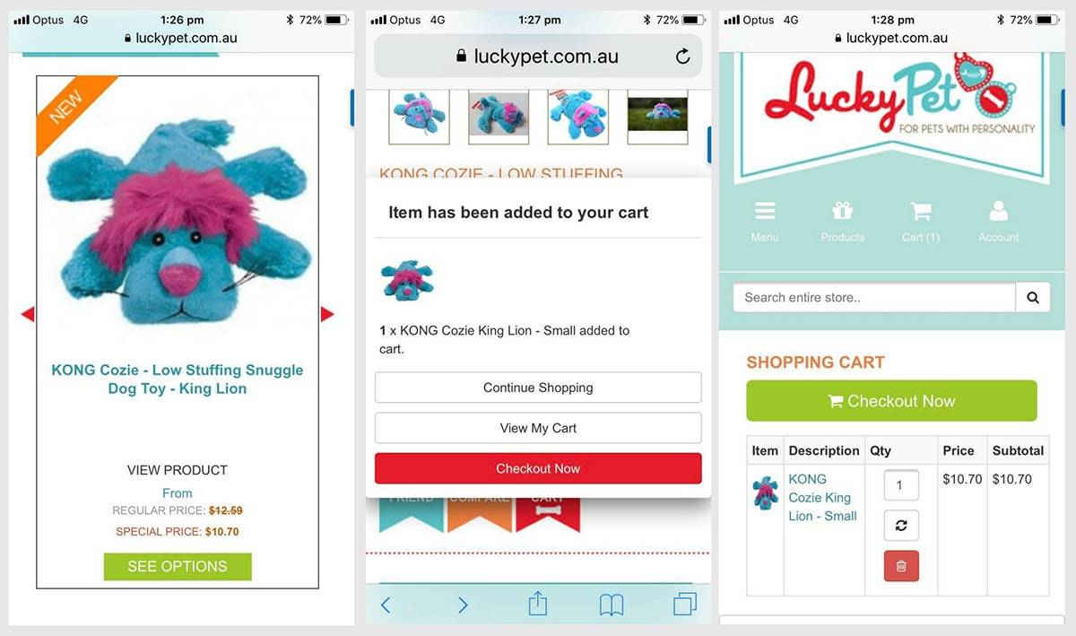
Take look at Lucky Pet and you’ll notice how well their design translates to mobile and how quickly you can move through the pages. They rate well on Google’s page speed and mobile friendly tests.
As strange as it sounds, there are ecommerce websites out there that focus a little too much on how beautiful their site looks and forget to make it easy for buyers to well… buy. We’ve covered this before when looking at how to design an ecommerce website and it really comes down to prominent call to action buttons that use clear action-oriented text and appropriate colors.
Mentone Educational has kept their colour scheme very basic and in fact, the only element they’ve chosen to stand out in colour is their ‘add to cart’ button.
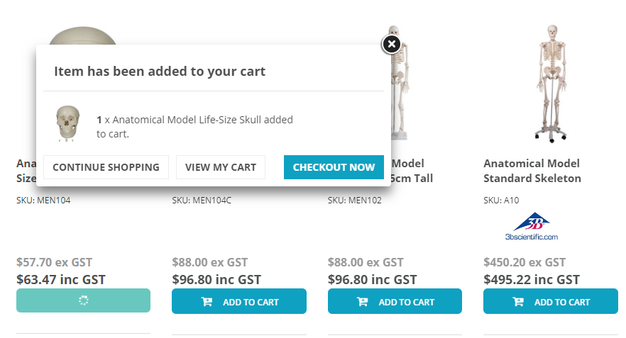
Once you’ve done just that, the pop-up screen prominently displays another three action buttons to guide the buyer easily through the buying process.
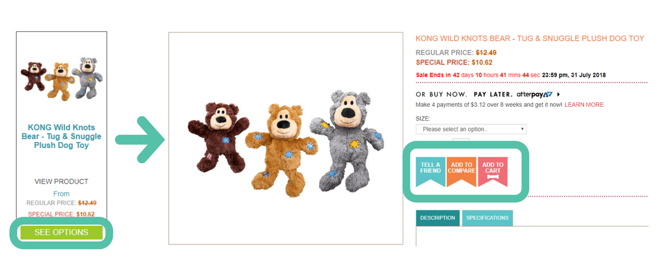
It’s not just all about the ‘add to cart’ button though, we think Lucky Pet is onto a winner with their ‘see options’ button: once you click through, you have the option to ‘tell a friend’, ‘add to compare’ and ‘add to cart’.
The very last step in the buying process is getting your customer to hand over their personal details and credit card (no mean feat!). There are many reasons your new buyer may baulk at this stage – perhaps their lunch break is over and they’ve got to dash to a meeting or the baby’s just woken from their afternoon sleep. Shoppers are time poor and if you add too many steps to this last hurdle, you’re going to lose them.
Most people are at least a little reluctant to give you any more data than they actually have to and don’t really want to remember yet another password. In a nutshell, people would prefer to buy without signing up – at least at this stage. Once they realise how great you are and come back for a second or third time, an account is easier for them.
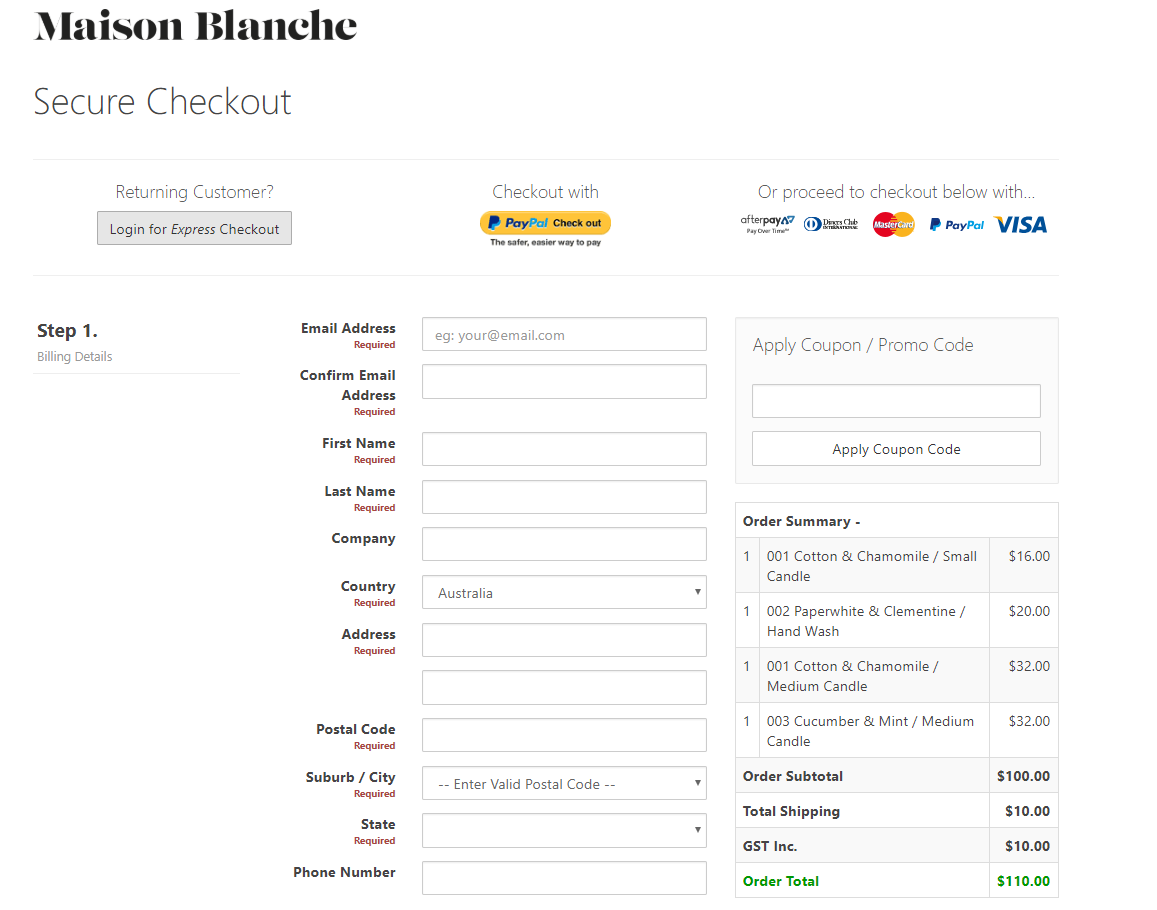
Remember, they also don’t want to be scared off by page after page of steps at the checkout. Take a look at Maison Blanche’s single page checkout which is a standard on all our Neto websites. The buyer can see at a glance that it’s a very quick process to complete their purchase, and all menus are removed to avoid distraction.
Notice the ‘Returning Customer’ section at the top – each purchaser is given the option to join after they’ve checked out. And remember, even if they haven’t registered, you still have their information so you’re able to market to them via email, just so long as you let them know you are adding them to a list, and give them the option to unsubscribe.
Your ecommerce website design needs to give special consideration to both the user interface and user experience in order to be successful. And remember user testing is vital in this process so be sure to rope in staff and friends to test it out on the proviso that they’re objective and tell you the truth about how they rate the look and usability of your website. It’s also a good idea to note down your key website and ecommerce metrics (e.g. conversions, time on page, bounce rate), before and after you make any design or usability changes so that you know exactly what works.
For more in-depth advice on setting up your product pages, check out: 5 easy ways to optimise your product pages for higher conversions. Or revisit Part 1 of this article and view even more inspiring website designs from our customers.
